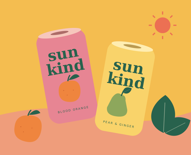
A cheerful packaging concept for a small-batch juice brand. Fruit-forward, a little offbeat, and made to bring some sunshine to the everyday.
The idea
Sun Kind needed a visual world that felt as good as a cold juice on a warm day. I developed a playful family of fruit illustrations that could travel from the can to market signage and social posts.
Making it happen
Big fruit, bold lettering, and unexpected color pairings do most of the talking. I kept the linework loose and the fruit delightfully imperfect. The two initial flavors share a simple structure, making it easy to welcome new additions to the family.